Eclipse Soundscapes
Redesigning the Data Analyst process to be accessible for blind or low-vision users and encourage full completion.
UX Research, UI Design, Wordpress, WCAG Accessibility
Role: UX Design Team Lead
Duration: 2.5 months (2024)

Overview
Eclipse Soundscapes (ES) is a NASA-funded citizen science project that allows people to participate in studying the effects of solar eclipses on Earth life. With an audio data collection from the 2024 total solar eclipse, participants can take on the role of Data Analysts by listening to audio clips and answering questions via Google Forms.
This experience is needed to be made more accessible to users who are blind or have low vision.
THE PROBLEM
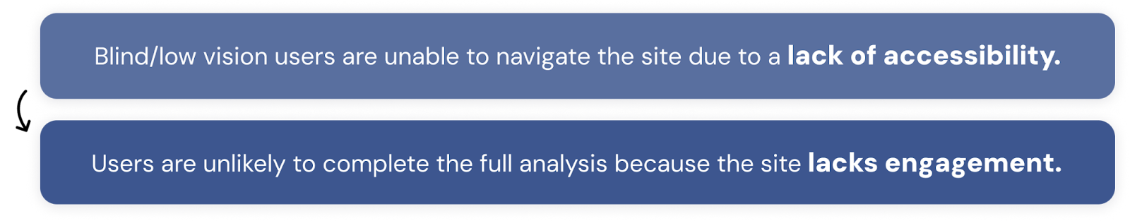
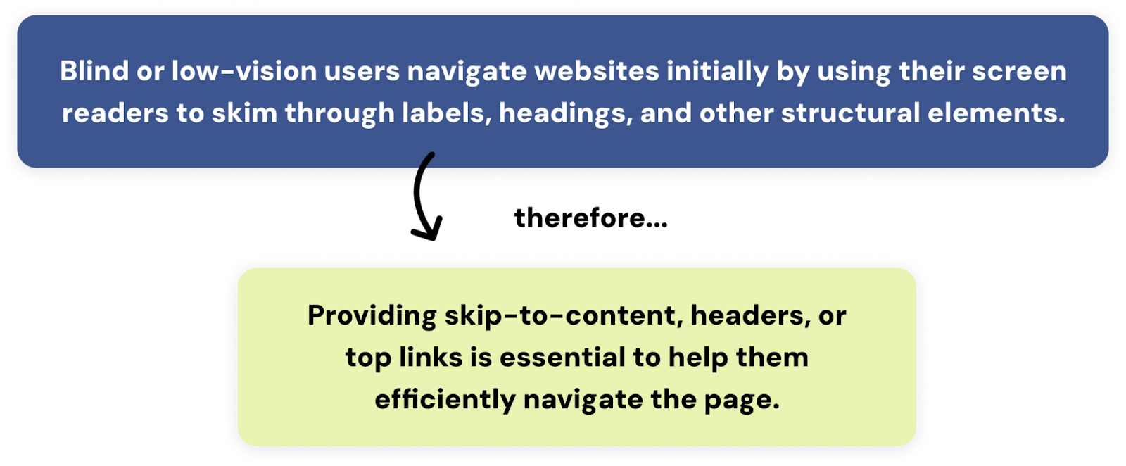
Blind and low vision users are unable to navigate the site due to a lack of accessibility and screen-reader compliance.
PROCESS BREAKDOWN
Research
USABILITY TESTING How is it working now?
Our process began with gauging the issues first-hand on the existing Data Analyst site.
Current Site
.png)
By asking 8 participants to freely navigate and complete the audio clip analysis, we observed their natural interactions and discovered two other frustrations with the current webpage:
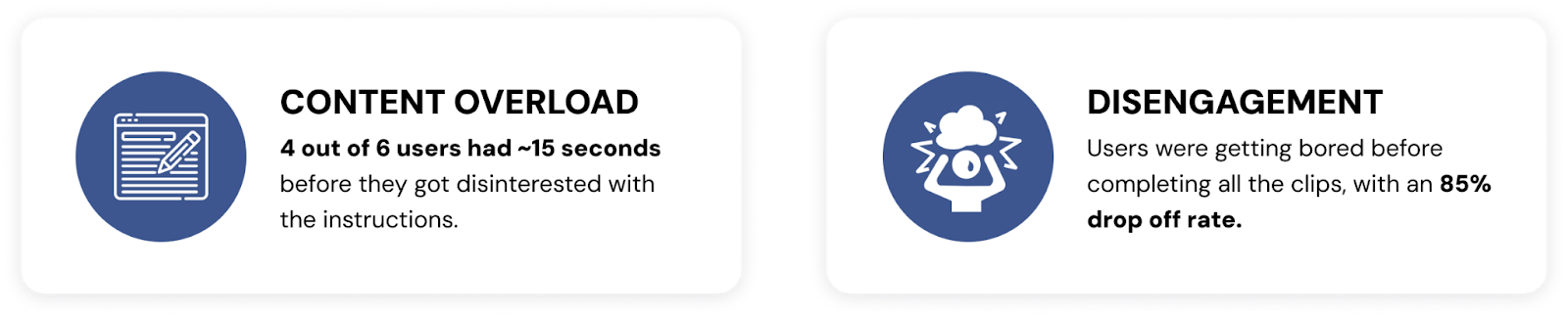
In discovering this, our problem got even bigger…
The design needs to be both accessible to disabled communities, and more engaging to follow through and finish.
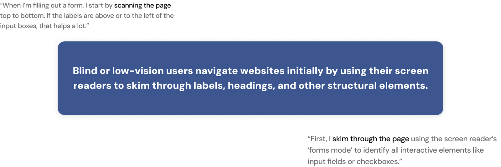
INTERVIEWS How do users do it?
We continued the process by interviewing 6 participants with a background of blind, low vision and/or colorblindness, to understand their personal journeys on navigating web platforms.
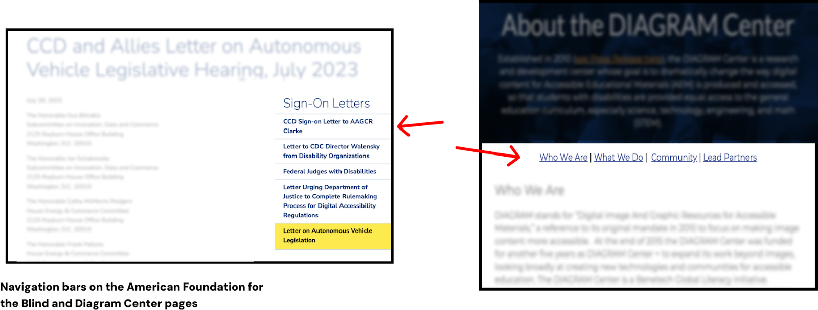
COMPETITIVE ANALYSIS How do other companies do it?
A standard template for design that currently serves blind and low-vision users must already exist. To establish a starting point, we went through platforms designed for audio listening and organizations focused on low-vision support.
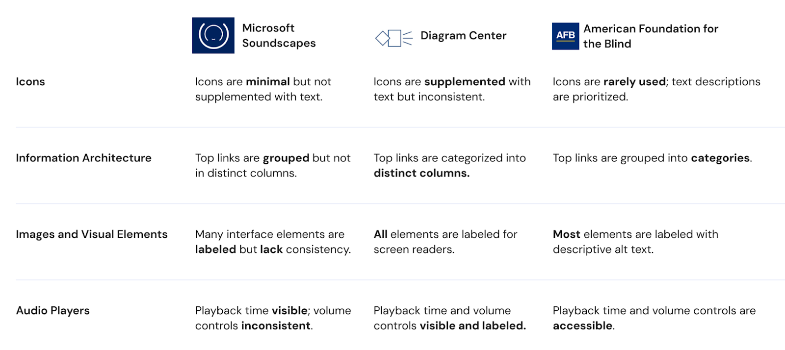
What we found was more evidence that supported our users:
Analyze
USER PERSONAS
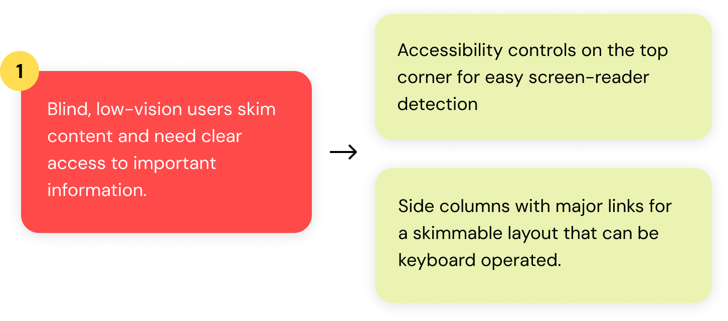
Based on our interviews, we identified two main user personas reflecting the ES demographic to keep in mind while designing.
Drawing from their needs and frustrations, our team drew out four key functionalities to improve the Data Analyst process:
Design
We then made some wireframes to test out with participants before jumping into high-fidelity designs:
Lofi Designs
Test
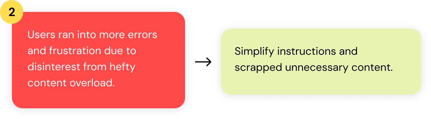
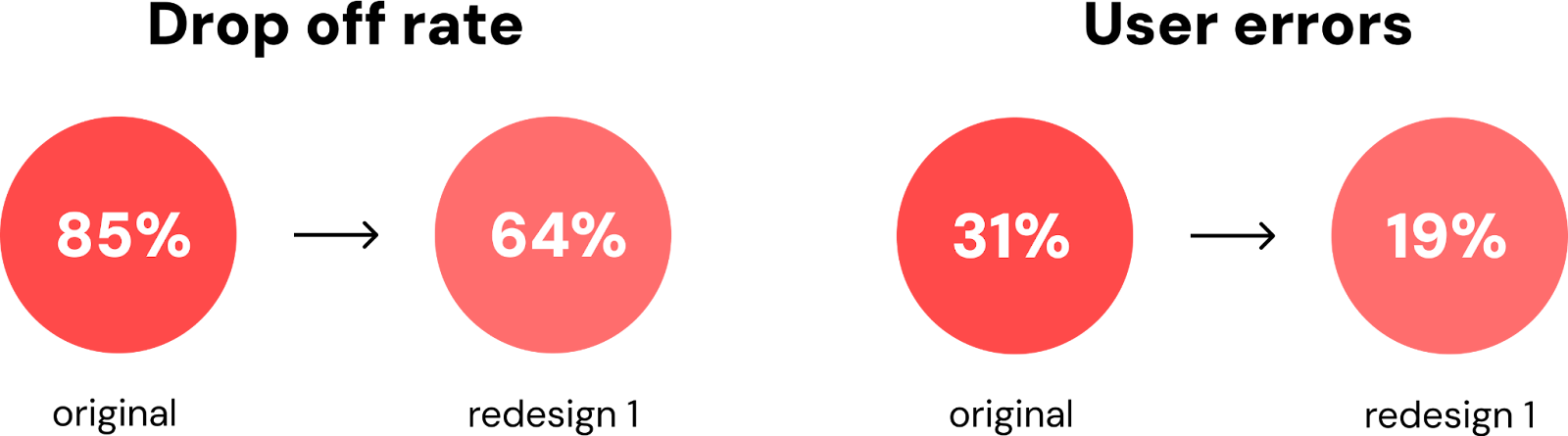
With 8 participants to evaluate our prototypes, we focused on how effectively the new features influenced our users’ drop off rate and minimized errors due to visual disabilities. The following aspects highlight the results from our initial test, and the changes we implemented in our final designs.
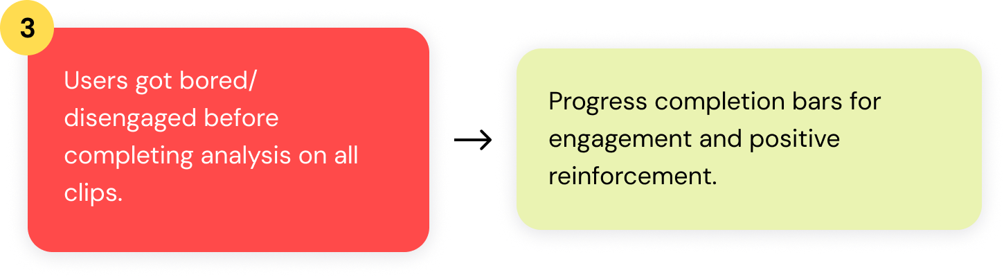
Progress Completion Bar
Users did more of the process, but still 64% of users felt unmotivated to complete all three audio clips. Our assumption was that the progress bar still appeared as a typical navigation element. We redesigned it to have a streamlined arrow navigation with more contrasting colors to indicate progress.
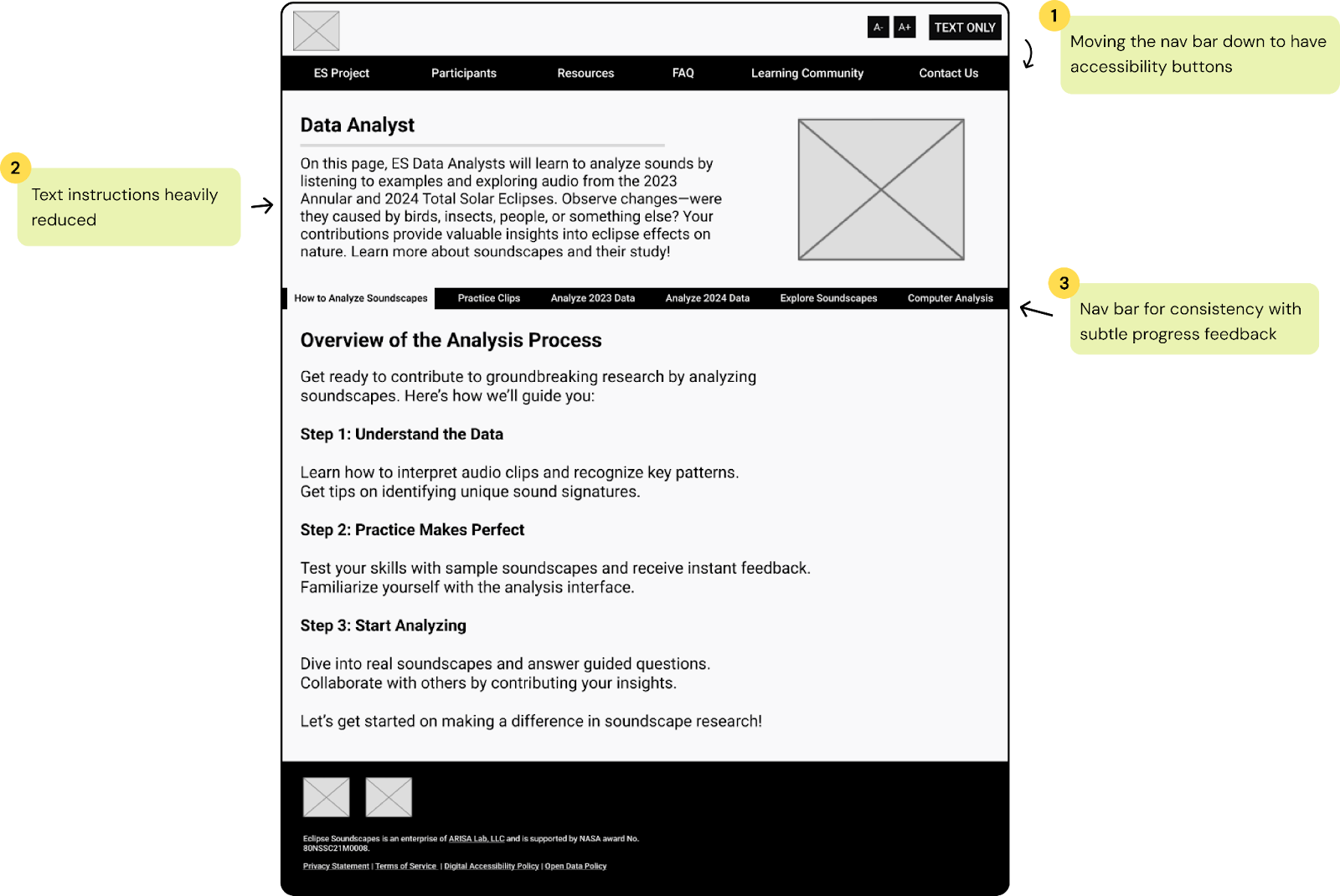
Accessibility Buttons and Style Consistency
Low vision users initially overlooked the interactive functionality of accessibility buttons. To make them more noticeable, I rounded the buttons and matched them to the other interactive buttons on the site.
Other user errors became apparent to us during our intitial tests, that became part of our major changes to our final designs:
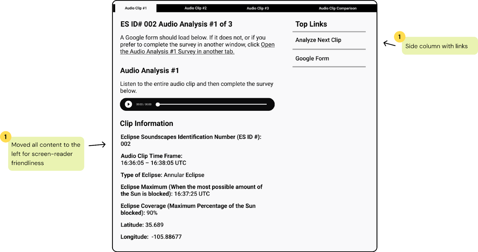
Content Layout
Users either misclicked or didn't notice the Google survey hyperlink before the audio clip. Since listening to the audio clip is the intended first step, we made the survey link into a huge button instead, and placed it after the audio player.
Audio Player Design
Users took about 12 seconds longer to engage with the audio clip when it was customized, compared to the unstyled version. We decided to leave them unmodified to avoid confusion and an unnecessary learning curve. The default player provided a more intuitive and faster interaction.
With these observations, we iterated the designs and tested again to see if there were better improvements in our previous measurements.
Final
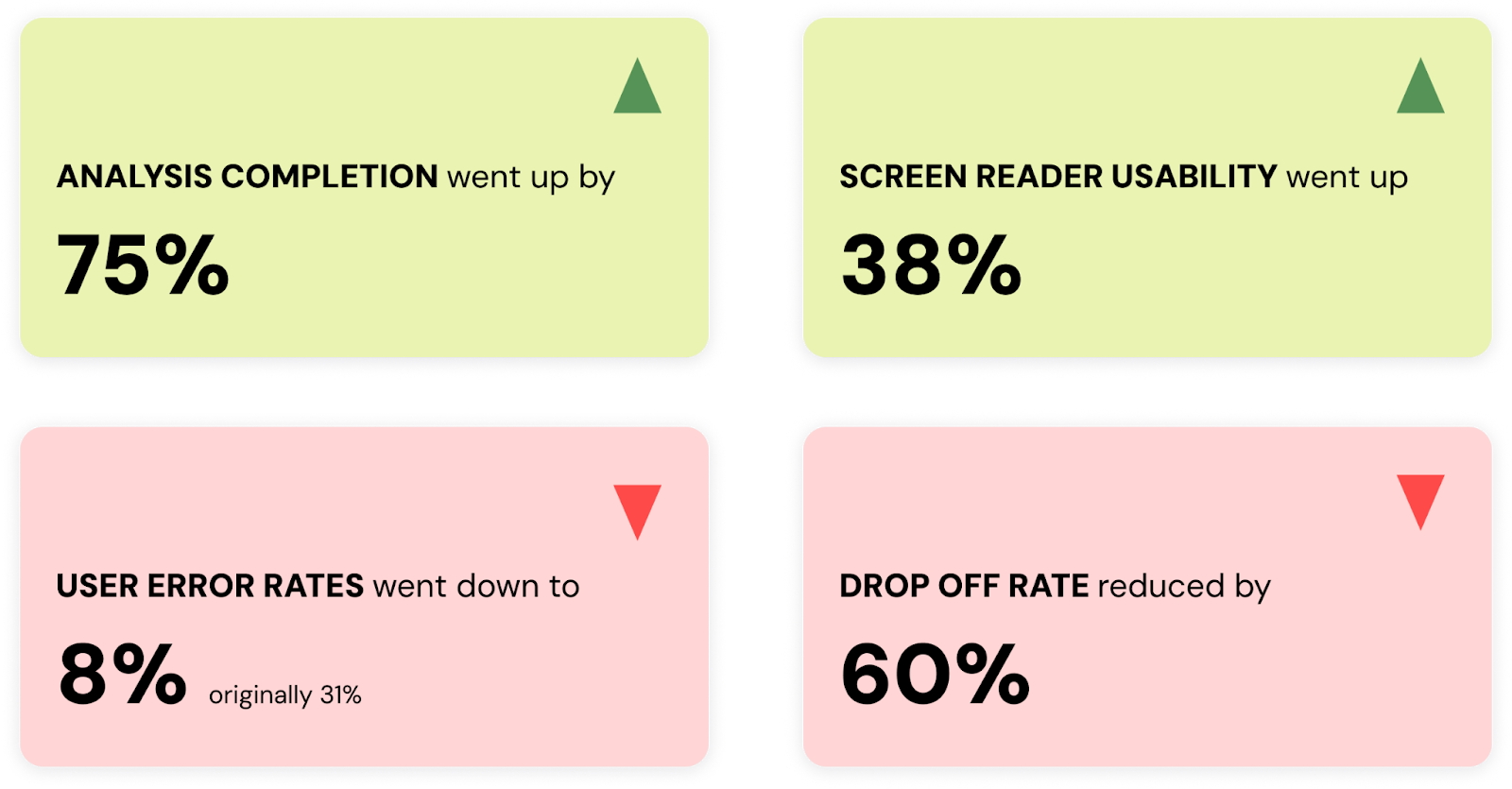
RESULTS
From comparing the results of our usability test on the old Data Analyst site, here are our final testing results:
REFLECTION
The client was thrilled with the level of care put into reaching out to those with accessibility challenges. By implementing features like prominent accessibility controls, intuitive navigation, and interactive feedback mechanisms, we showcased a clear understanding of their needs. These enhancements not only made the platform more accessible but also ensured that users remained engaged from start to finish.
Working on this UX project was an incredibly rewarding experience! It was nice to learn more about designing for accessibility, specifically with screen readers and interfaces that cater to blind and low-vision users. The challenge of balancing usability with visual appeal pushed me to think critically.
