Online Eyecare Store Redesign
Redesigning an eyeglass e-commerce store for an optometrist clinic to increase sales
UX Research, User flows, D2C E-commerce Design
Role: UX / Front-end Designer
Duration: 3 Months (2023)

Overview
Aside from treating patients, D'ussan Optical is an optometrist clinic in Astoria, Queens, that sells glasses, eye health products, and contact lenses on their e-commerce website. They hired me to redo their site with a more appealing look, organize their inventory for easier restocking, and improve the shopping navigation experience for their customers. I worked closely with the two owners to understand their goals and bring their ideal e-commerce store to life.
Objective
Redesign this site to have a simpler navigation, attract more customers, and be more functional to add and sell specific eye products.
Previous Designs
The website had several usability issues, and the overall design lacked user feedback and visual appeal for the client's preferences. Collaborating closely with the client, we identified areas for improvement and incorporated my suggestions for UX best practices to elevate the design.
Considerations
- The client provided an existing style guide to follow.
- They requested navigation to brand pages be included on every page.
- Ensuring the site was accessible in Spanish was a priority.
- The client emphasized maintaining a clean and modern aesthetic to reflect their brand identity.
- The client wanted the website to clearly communicate that they sell more than just glasses, with separate inventory or navigation sections for contact lenses, glasses, and health products.
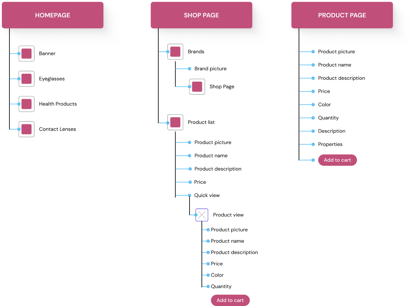
Userflow
Based on these notes, I created the ideal user flow for the client and their customers. This site would allow the user to automatically have access to navigate all categories: health products, eyeglasses, or contact lenses. Each shopping page would also have a brand gallery grid at the top, as per request of the client and their customers.
Key UX Changes
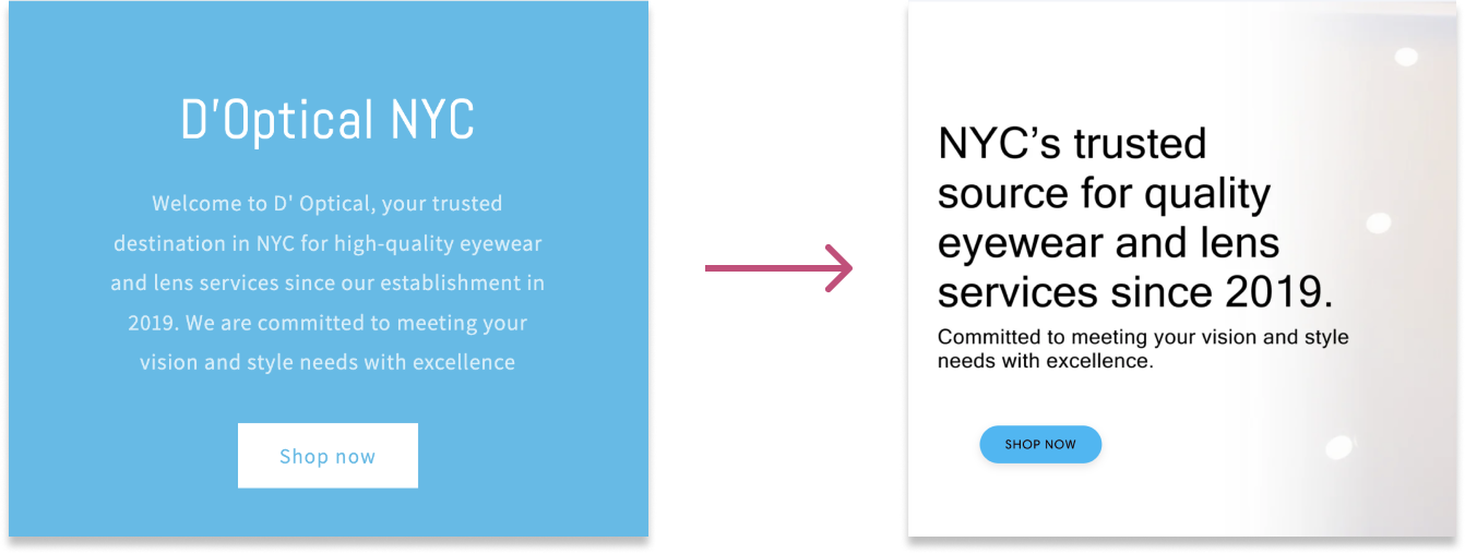
Since this is an eye focused e-commerce shop, I implemented minor accessibility tactics from my previous projects to follow an easy structure to the homepage. Here's a quick side by side:
Color Contrast on Banner
One of the first red flags I noticed was that the banner was unreadable with poor color contrast and centered text-heavy content. With the client, we worked to shorten the tagline and increased its eligibility.
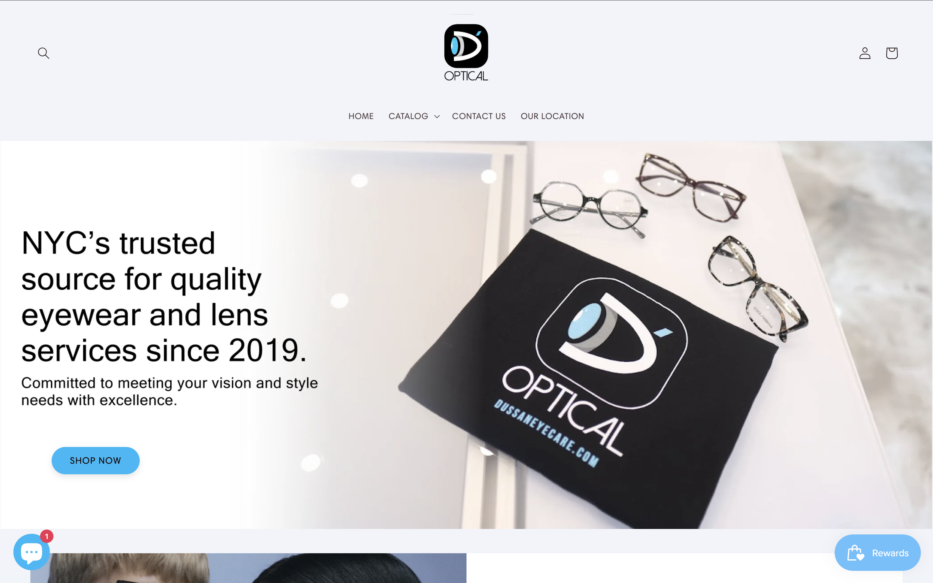
Alignment and Buttons
The Z-pattern navigation wasn’t effective for some older customers, so I switched to a uniform navigation that reduced eye movement. The buttons were also made clearer to better indicate clickable product categories.
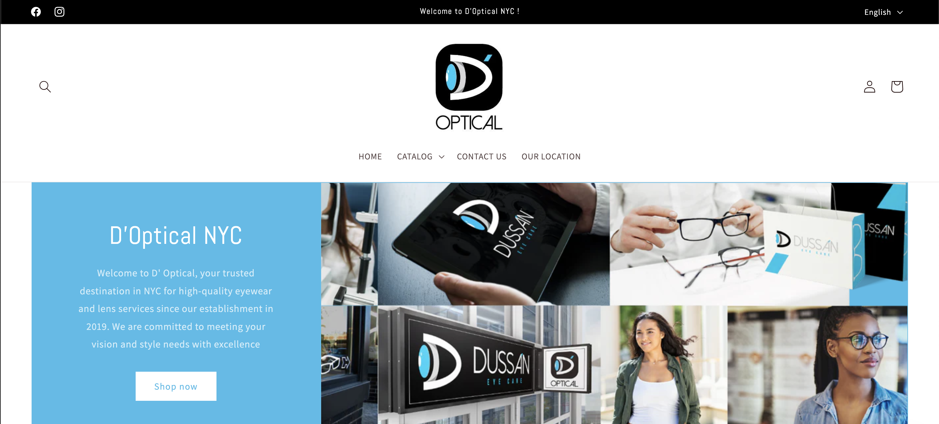
Live Website
You can shop for eyeglasses now on the live website. Check it out here!
Takeaways
Compromise
Collaboration often requires finding common ground. Working with a founder who knows more about the expectations for their company and have their personal design preferences challenged me to balance their perspectives. By analyzing their needs and feedback, I designed their site for their ease of use and satisfaction in mind.
Advocating for what you know
Understanding best UX practices is essential, but equally important is the ability to effectively advocate for them. I learned more about how these practices aligned with the client’s goals and especially how to foster productive conversations.
